
Over the past year, a team of paid consultants and volunteer developers at WikiTree created an updated look for WikiTree. WikiTree, the free, one-world tree, is the place I share my best genealogical research. Check out my profile to see how active I am on WikiTree. I joined in 2017 and since then I have edited hundreds of profiles, created Free Space Pages, and I manage over 350 profiles. I’ve used the old system and the new one to edit and create profiles and Free Space Pages. I’m very familiar with WikiTree, including its strengths and shortcomings.
WikiTree is a publicly available website and far more likely to outlast me than any other place my research resides. WikiTree is not known for flash. After all, without income from memberships (WikiTree is financed by unobtrusive ads that are only shown to non-members or members who are not logged in), WikiTree lacks the budget power of Ancestry, MyHeritage, or software companies. They have done an amazing job with the redesign.
Let’s take a look at some of the updates on the profile of Arthur Hilton. I’m his two-times-great grand-niece. He died young, and he’s one of the people I honour at WikiTree.
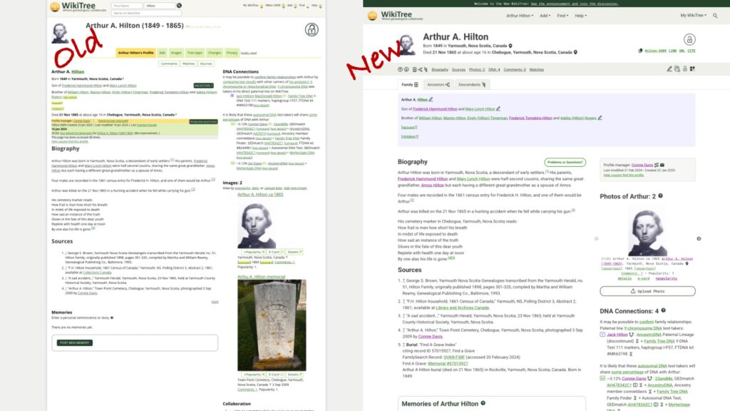
The overall look is cleaner and better organized. The huge grey border (a total waste of space) is gone and there’s a better balance between the two columns. The larger font is easier to read and the use of colour makes sense. See that blue box? It’s a visual cue that I’m looking at the profile of a biological male. The hypertext is green and links you have clicked are purple.
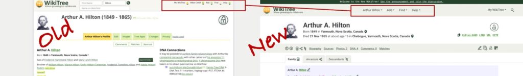
The area for the WikiTree ID and dropdown menus has been streamlined and cleaned up. The menus are more visible with the larger font and the menus themselves contain less clutter. (The menus are not shown here! Click on one and check them out!)
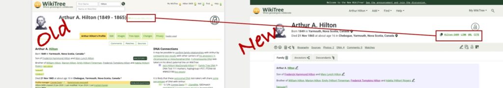
The visibility of useful copyable text options is perfect! In the old version, they were almost invisible in tiny green font. They are now clearly marked with a new copy icon, familiar from other websites. I use these links when sharing profiles in emails, adding links within profiles, and in my research logs. And if you like to cite WikiTree, you can do that here with one click.
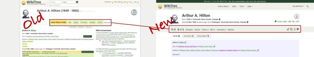
Like all good websites, there’s usually more than one way to navigate. This menu in grey background is a redesigned tab menu. It uses icons and text to move commonly used features and actions together. The more experienced WikiTree user wants to access profiles and features quickly without scrolling, and here they are. I’m referring to this as the “Quick Menu.” Well done, design team! I love the simple navigation arrows and ability to jump to the part of the profile I want to see, (including the ancestors and descendants tabs), the “edit” pencil, the profile change history icon, familiar privacy icon (padlock), and the new Tree apps icon.
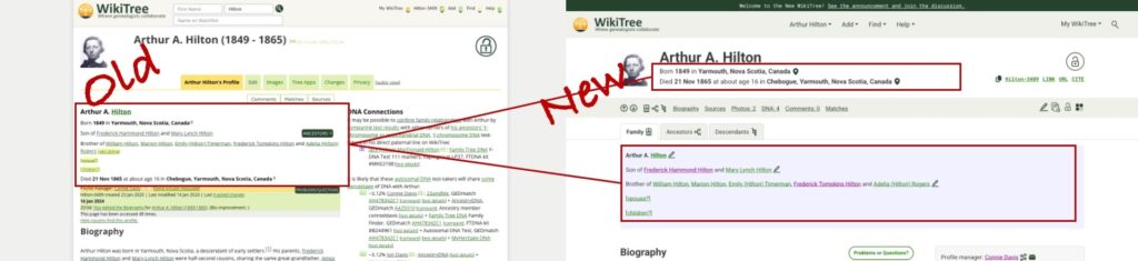
Information that was small and difficult to parse is now separated with better placement in the profile. Key details (birth and death with locations and certainty indicators) now appears immediately below the larger, improved name block. Relationship information is in the shaded block, blue for Arthur, a biological male.
Finding the profile manager is also easier.
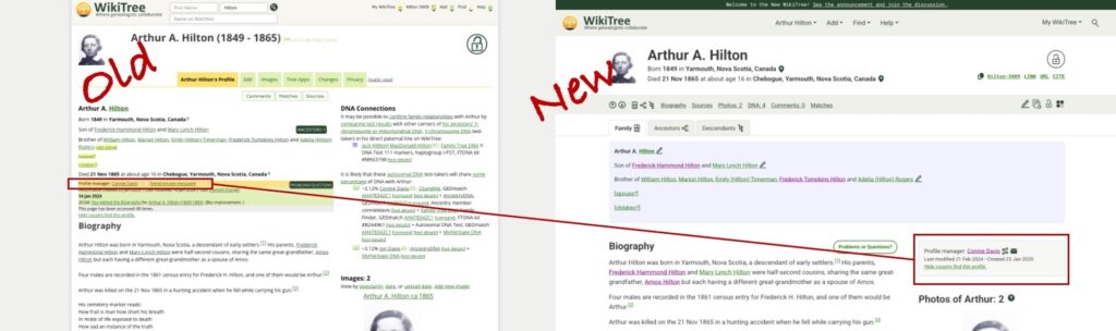
The profile manager formerly appeared in small font in the crowded area on the left. It now has its own shaded block on the right. In addition to allowing an instant email to the profile manager, there is now a redesigned “connections” icon which allows you to see how the profile manager is connected to the profile. In the past, I needed to go to another part of WikiTree to see this information. Now when I contact a profile manager, I may gain insight of their motivation to create or manage the profile.
The next improvement may be lost on many WikiTreer users.
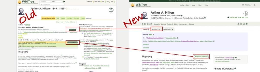
As part of the Ambassador team at WikiTree and someone who is often demonstrating WikiTree, I appreciate that the Ancestors Button and Problems/Questions buttons are no longer in a similar position with the same design. Note: There would be a descendants button on the “old” version if Arthur had descendants. The new design allows the user to access ancestors or descendants using the icon in the grey Quick Menu bar or using the clearly visible tab.

Either option opens a family tree for Arthur, also with an improved look and feel. It features separated colour blocks, cleaner font and icons, and arrows to navigate further back in the tree. The Descendants view has similar improvements.
Back on the profile page, it’s time to look at the treatment of DNA in the new profile.
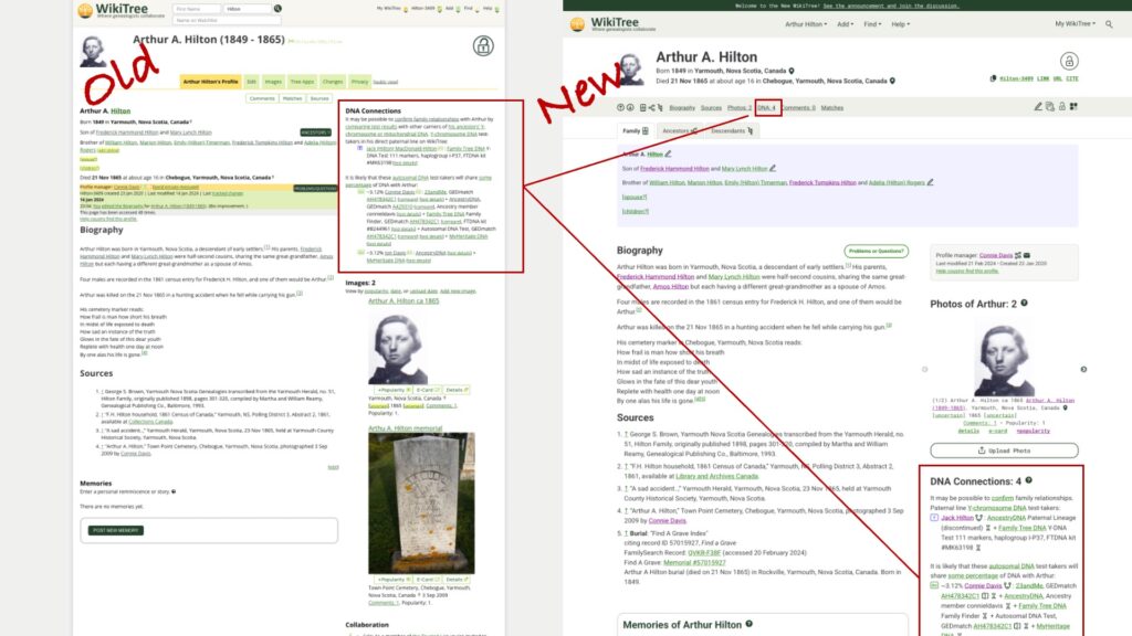
DNA Connections can now be accessed via the Quick Menu in grey and is found in a familiar location along the right, now below a redesigned photo section. Again, the text block is cleaner, easier to read, and only contains the information it needs to contain.
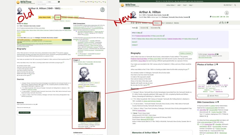
The old images block sometimes made a simple profile like Arthur’s lopsided, with the photos dominating the right side. A new photo block allows you to toggle through the uploaded images using a navigation arrow to the side of each photo. You can also navigate quickly to the “Upload Photos” page, which has also received an update and is cleaner and easier to use. Again, kudos to the Design Team and programmers. They went over this website with a fine-toothed comb!

In the past, the use of yellow background wasn’t clear to me. Now yellow highlights collaboration and ongoing research. The collaboration language is friendly and clear. The research block encourages people to check out the incredibly useful WikiTree Sourcer Extension (which works great with the new updates.)
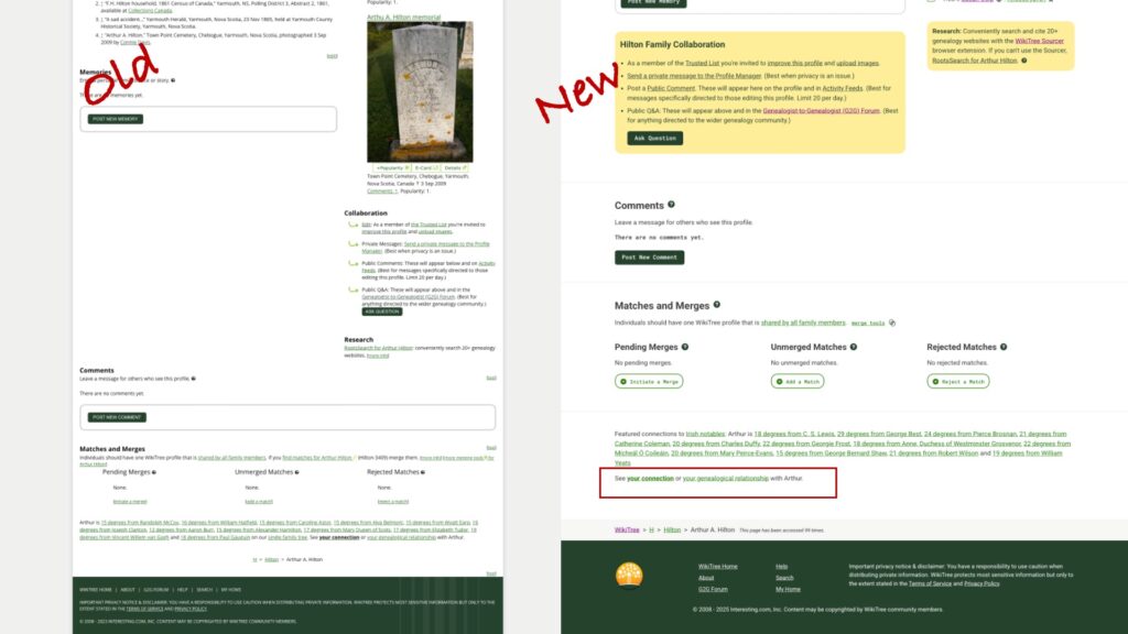
Scrolling down, you can see how the new design makes better use of space – there is not a huge empty block to the left. In profiles with a longer biography, there will be blank space to the smaller right side of the page. The Comments and Match and Merge sections have gotten the cleaner, pithier treatment, and thankfully, the text with “See your connection or your genealogical relationship with Arthur” is now separated from the Featured Connections text.
Even the footer is now easier to read and more pleasing to the eye.
I know this is a tiny glimpse of all that was accomplished with this redesign, and there’s much more I haven’t noticed yet. I look forward to finding the features I’ve missed, and new features that may replace what I’ve shown here.
Well done, WikiTree!
And if you’re new to WikiTree, welcome! Check out the Help links on WikiTree and useful information at the WikiTree YouTube channel.